PACKGAMI
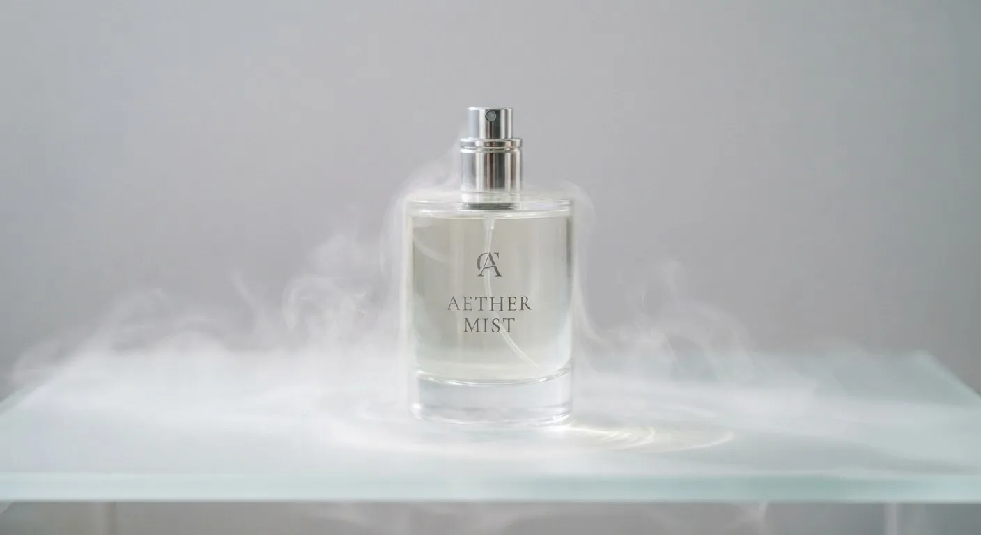
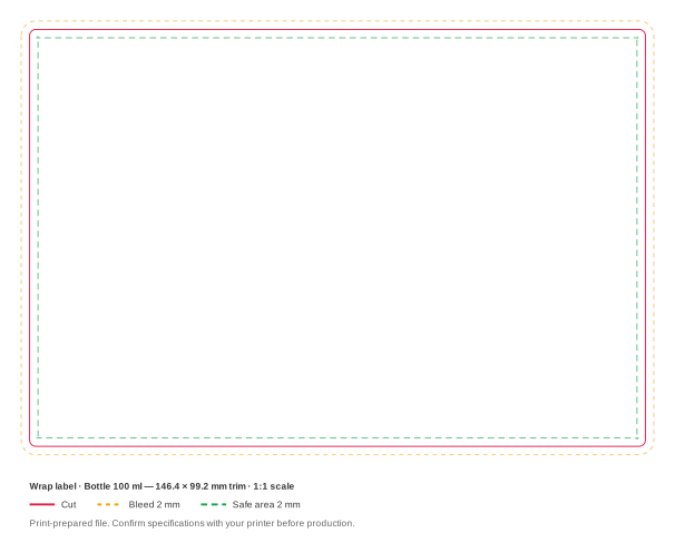
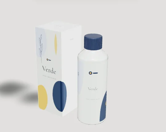
Toner sells in bigger volumes than most of the skincare range, because people use it generously on cotton pads or splash it on with their hands. That makes the toner bottle the tallest item on the shelf next to the serum and the moisturiser, and the label behaves more like a small poster than a wrap.
Retail toners are often 150 to 250 ml. Our engine's reference bottles stop at 100 ml today, so the sizes table shows 50 and 100 ml bottles. Use them as proportion references for a larger bottle, not as its dimensions. Closures vary too: an orifice reducer under a screw cap, a flip-top or disc-top, or a mist sprayer. The drawing shows the engine's screw cap.
Design tips
- Use the height for vertical type. On our 100 ml reference bottle the label band is 103.2 mm tall on a body only 45 mm wide. A product name set vertically, or a tall stacked layout, uses that shape better than a squat horizontal logo.
- Tell people how to use it. Toner is the step shoppers are least sure about. A short line on the front, such as "Sweep over clean skin with a cotton pad", answers that and helps the bottle sell.
- Design for a wet bathroom. Toner bottles live next to the sink and get picked up with wet hands. Choose a film label or a wet-strength stock, and consider a shrink sleeve if you want full coverage on a PET bottle.
- Plan the back label for a see-through pack. Most toners are clear liquids in clear bottles, so the back label reads through the front. Either design the two labels as a deliberate pair or put an opaque white base under the front label.
- Leave room for warnings on acid toners. Exfoliating AHA and BHA toners often carry sun-sensitivity and patch-test wording. Agree the exact text with your safety assessor and reserve space for it on the back label from the first draft.