PACKGAMI
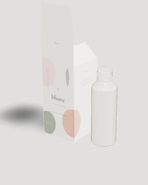
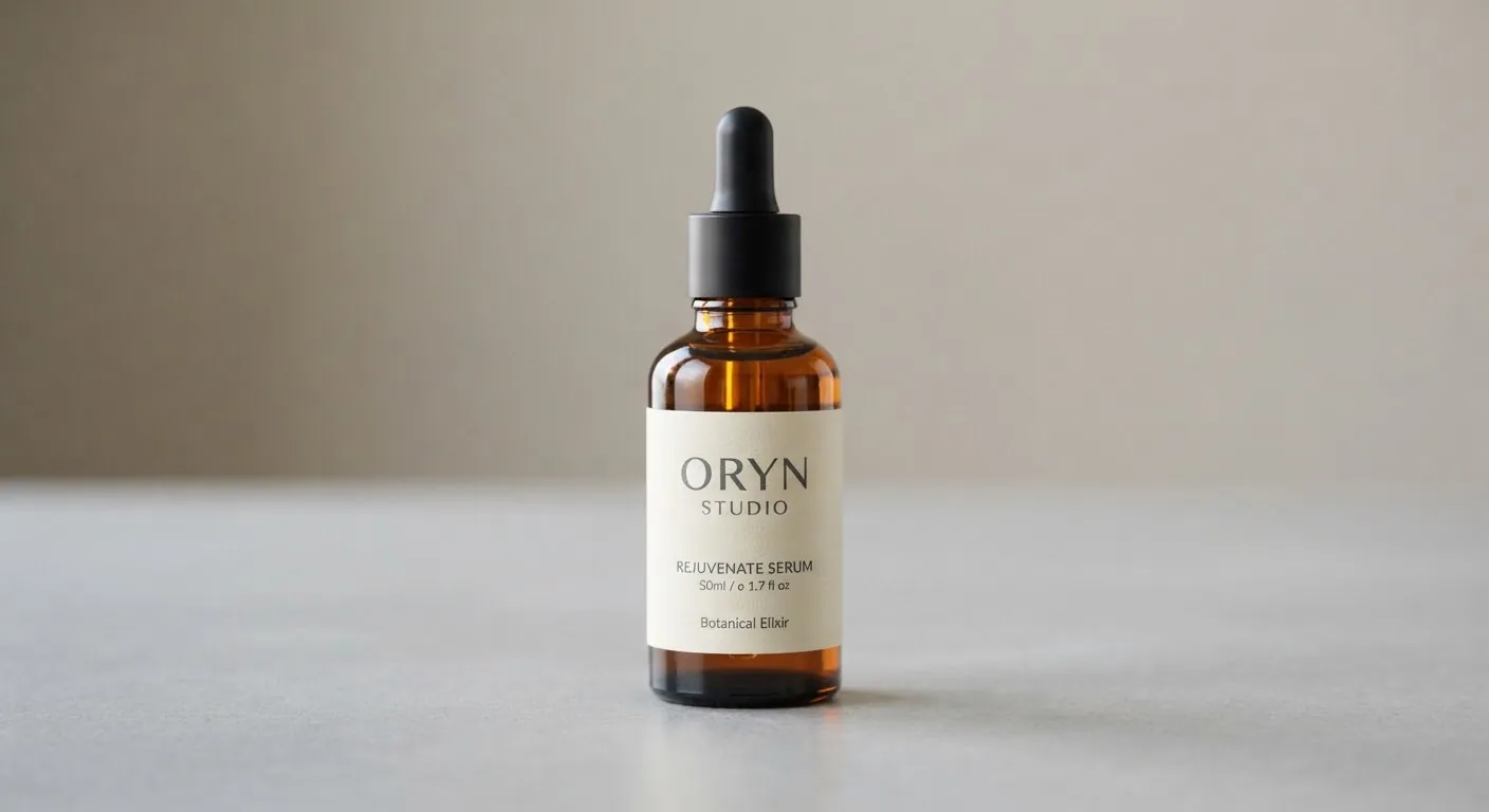
Face oils are the hardest product to keep a label looking good on. Oil creeps under label edges, turns uncoated paper translucent and can soften adhesives that were never meant for it. The bottle is usually the same family as a serum bottle (a 30 ml glass round with a dropper), but the materials around the label need much more care.
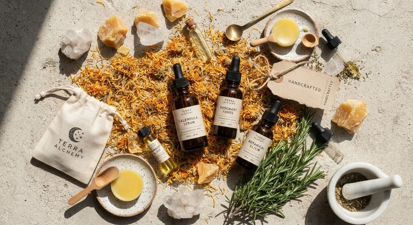
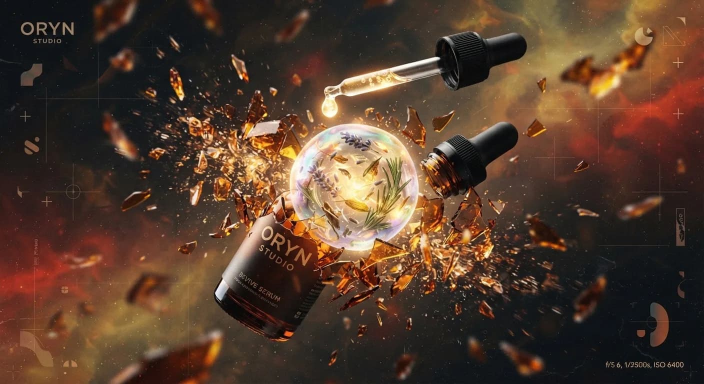
There is also a trade-off between showing and protecting the product. Rosehip, sea buckthorn and blue tansy oils have colours worth showing off, yet plant oils oxidise in light. Most brands land on tinted glass and use the label, rather than the liquid, to carry the colour story.
Design tips
- Specify oil resistance in the print brief. Name it in writing: face stock, adhesive and finish all need to hold up to oil. Film labels with an oil-rated adhesive are the safe default. If you want the feel of paper, seal it with a laminate.
- Stop the label short of the shoulder. Oil runs down from the dropper and gathers where the shoulder meets the body. A label whose top edge sits a little below the shoulder has fewer drips sitting on its edge.
- Name the hero oils in plain words. Face oil buyers read the oil list. Put the two or three key oils on the front, for example "rosehip, squalane, jojoba", and keep the full INCI list for the back or the box.
- Use colour on the label when the glass hides the oil. If the bottle is amber or violet, a swatch, illustration or ink colour on the label can stand in for the colour of the oil inside.
- Proof the label with your own oil. Put a drop of the actual blend on a printed sample and leave it for a week. Check the ink, the edges and the adhesive before you approve the print run.