PACKGAMI
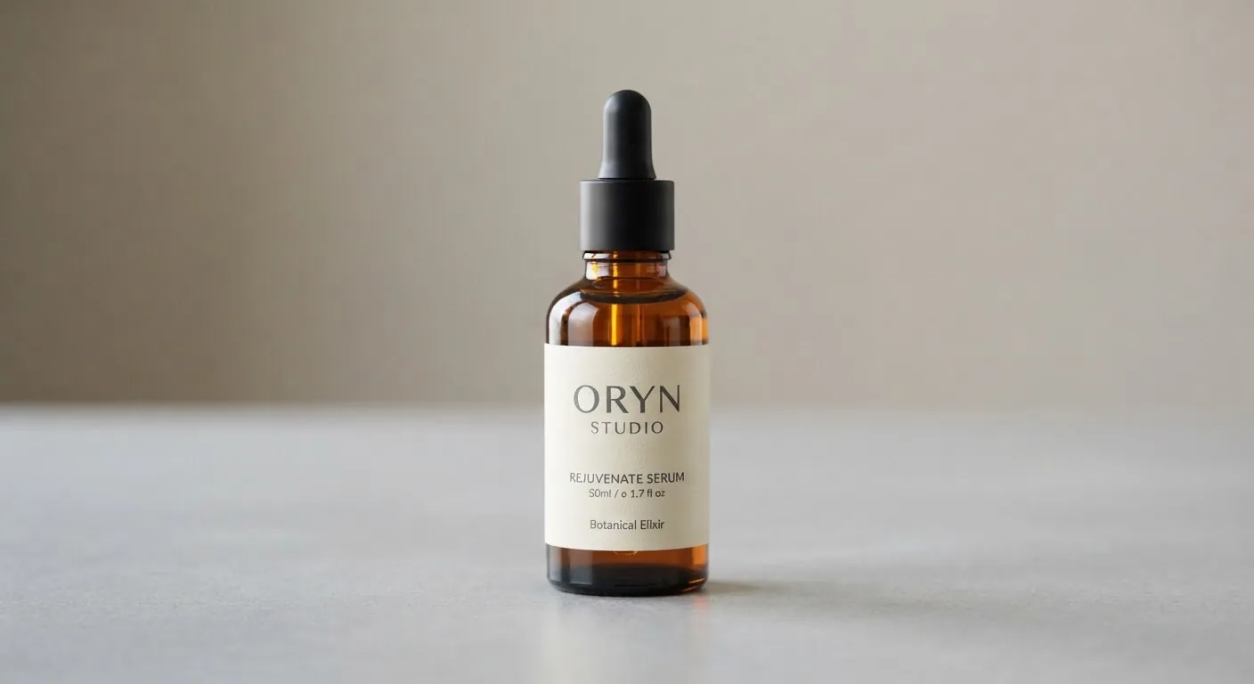
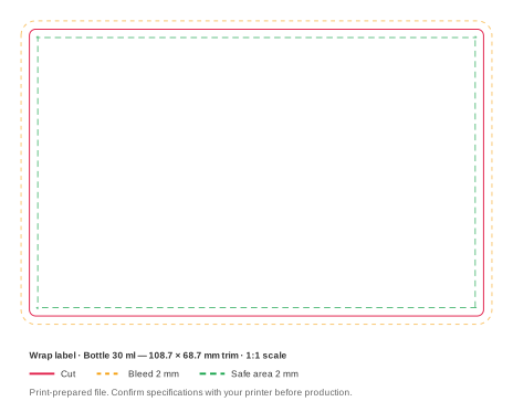
Dropper bottles are the standard pack for serums, face oils and tinctures. The bottle is small, round and usually glass, so the label has very little flat room to work with. The label band, the part of the bottle between the base curve and the shoulder, sets what you can print. The cap and dropper only add height.
Design tips
- Design for the curve. On a 33 mm bottle, text near the left and right edges of the front face turns away from the viewer. Keep the key information within the middle third of the front.
- Let the glass do some of the work. Amber and frosted glass already signal "skincare". A smaller label with more glass showing often looks more premium than a full wrap.
- Lead with the active. Shoppers compare serums by active and strength. Make "10% Niacinamide" or "2% Retinoid" the second thing they read, after the brand.
- Check legibility at real size. A 30 ml bottle is only 33 mm across, so the front face is narrow (see the sizes table). Body copy below 6 pt becomes hard to read and may not print cleanly on textured stock.
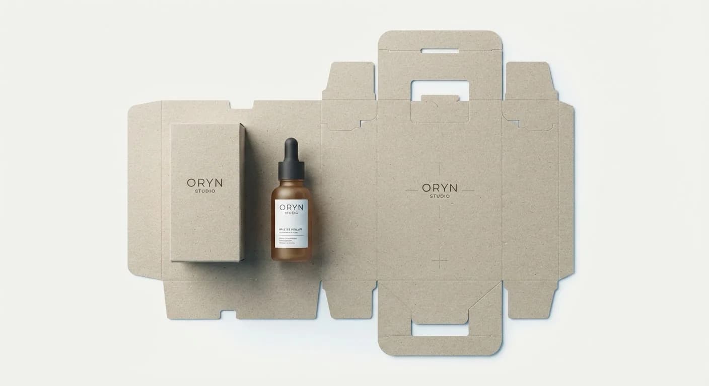
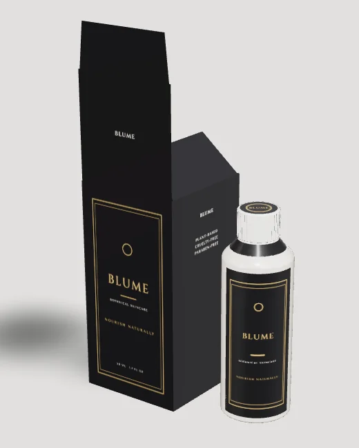
- Plan the carton with it. Most dropper serums ship in a folding carton. Size it to the bottle with the dropper fitted, not the bottle alone.