PACKGAMI
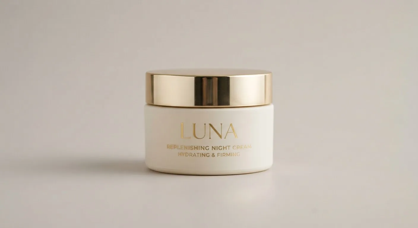
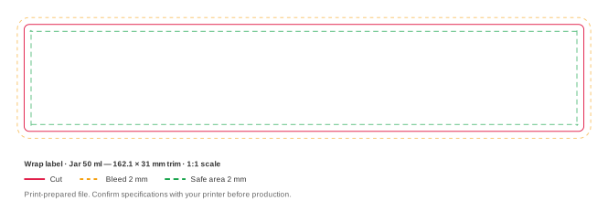
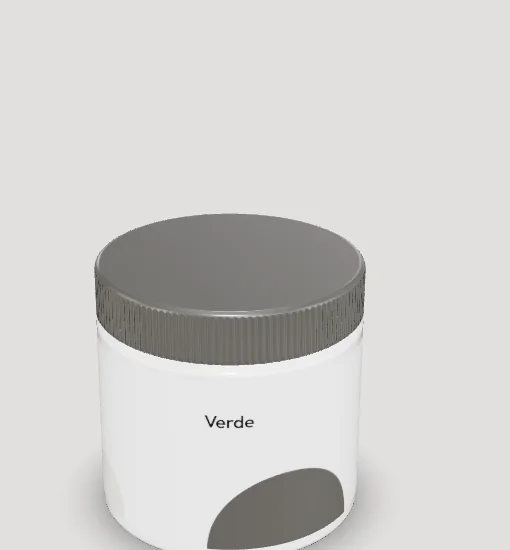
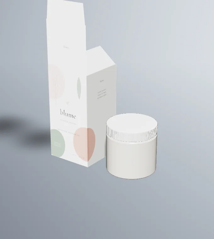
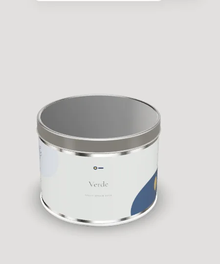
A jar is the opposite of a bottle: short, wide and mostly seen from above. On our 50 ml reference jar the side wall gives a 35 mm tall label band that runs about 157 mm around, a long thin strip, and the lid on top is the first thing anyone sees. Designing a cream jar is mostly a question of splitting the information well between the lid, the side band and the base.
Cream jars also come in more constructions than bottles do. Single-wall jars are simple. Double-wall jars put a decorative outer shell around a smaller inner cup, which changes both the visible volume and the surface the label sits on.
Design tips
- Treat the lid as the front panel. On a shelf or a dressing table, people look down at a jar. Put the brand and product name on the lid, set large enough to read from standing height.
- Lay the side band out as three zones. A strip 157 mm long and 35 mm tall works better split into front, side and back zones than as one centred panel. The front zone repeats the name, one side carries the claim, the back carries directions.
- Measure the outer shell on double-wall jars. On a double-wall jar the label goes on the outer shell, which can be taller than the cup inside. Take the label size from the shell. Our reference jars are single-wall.
- Keep clear of the lid skirt. Every time the lid is twisted, the skirt brushes the top of the side wall. Leave a small gap between the label and the lid line so the label edge doesn't scuff and lift.
- Use the base for the small print. A round base label takes batch, period-after-opening, address and ingredients off the side band, which keeps the visible faces clean.