PACKGAMI
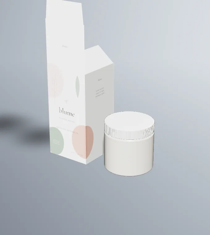
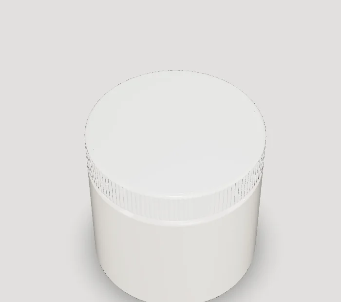
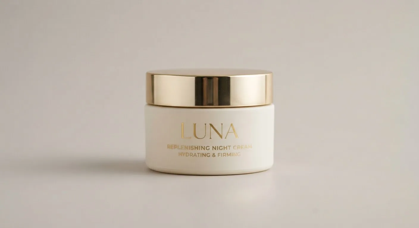
A moisturiser jar has one job a plain cream jar label doesn't always have: telling the shopper which moisturiser this is. Day or night, oily or dry skin, gel or rich cream, with SPF or without. Most ranges sell several moisturisers in the same jar, so the design system has to separate them at a glance.
The open jar also raises questions a bottle avoids. Fingers go straight into the product every day, so the pack is a good place to encourage good habits, with a spatula, a sealing disc and a clear period-after-opening mark.
Design tips
- Make variants differ in a big area. Day and night versions in identical jars get mixed up in a dim bathroom. Change a large surface, such as the lid colour, not just one word in the product name.
- Put skin type and texture on the lid. "Gel cream, oily skin" or "Rich cream, dry skin" on the lid answers the first question a shopper asks without picking the jar up.
- Only print SPF if the formula has been tested for it. An SPF number needs testing to a recognised standard. If the moisturiser has no SPF, keep sun and ray motifs off the pack so nobody assumes it protects them.
- Design the sealing disc as well. Many jars ship with an inner disc under the lid. It is the first thing seen on opening, and a cheap extra surface for directions or a short brand line.
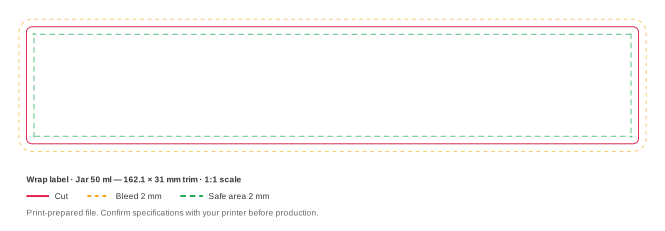
- Move up to the 250 ml jar for body moisturisers. Our 250 ml reference jar is 80 mm across with a 63.0 mm side band, tall enough for a proper front panel, where the 50 ml jar's 35.0 mm band only fits a strip.