PACKGAMI
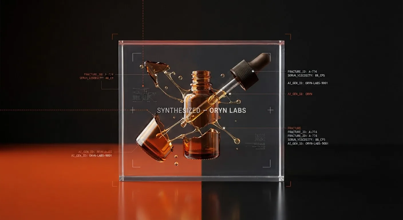
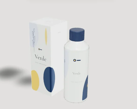
A serum is usually the most concentrated, most expensive step in a skincare routine, and its bottle has to signal that in a very small space. Most face serums sell in 30 ml glass, with 50 ml for larger formats. The closure is a separate choice: a dropper, a treatment pump or a plain screw cap all sit on the same neck. This page is about the bottle body and its label. For the closure itself, see the dropper bottle page.
The formula should drive the pack before the brand does. Actives that oxidise, like vitamin C and retinal, need protection from light and air, which is why so many of them come in amber or opaque glass or in airless pumps. A stable niacinamide or hyaluronic serum can go in clear glass and let the product show.
Design tips
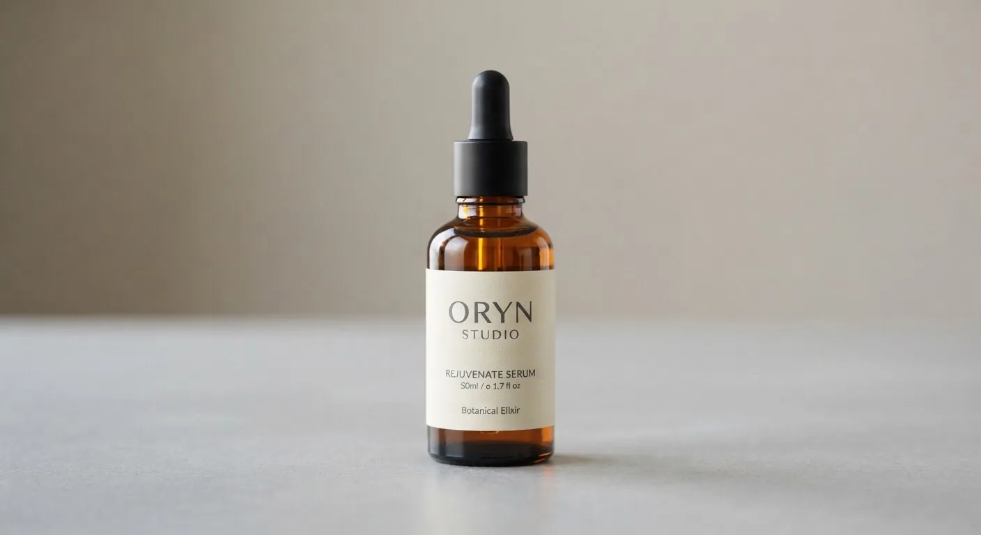
- Let the formula choose the glass colour. Agree the glass with your formulator first, then design the label against that colour. A white label on amber glass reads very differently from the same label on a white screen.
- Build the range grid before the first label. Serum lines grow quickly (niacinamide, then hyaluronic, then retinol). Fix where the brand, product name, active and strength sit, and change only one variable per product, such as an accent colour or a number.
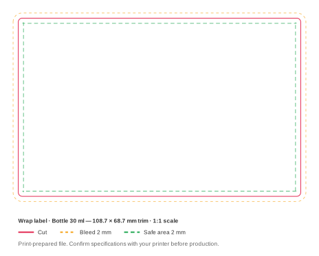
- Spend the extra height on the 50 ml well. Our 50 ml reference bottle has an 86.5 mm label band against 72.7 mm on the 30 ml. That is about 14 mm more, and it is better spent on directions or a second language than on a bigger logo.
- Reserve a clear window for the batch code. Batch numbers and best-before dates are often ink-jetted on the filling line. Leave an unprinted, uncoated patch on the back label where the printer can hit it.
- Pick a finish that survives sticky fingers. Serum bottles are handled with product on the fingertips. Uncoated paper marks quickly; a film label or a laminated paper stays clean for the life of the bottle.